Global Navigation Redesign

Summary
CRM Software is a powerful tool for organizations when handling large amounts of data but if the navigation is confusing, the power of that tool causes frustration and less adoption. Bloomerang was in need of a navigation redesign as the company was on the verge of adding more features and significant improvements to its architecture
My Role
UI/UX Design
User Testing
Design Architecture
The process
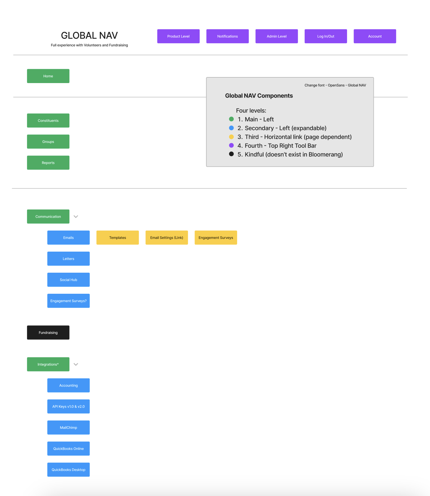
The first step in redesigning a product’s navigation is to take inventory of all the existing pages and creating a user map of how those pages are accessed. The second step was to identify where those routes overlapped, conflicted, or simply weren’t intuitive.


Pushing the Prototype
To test a new navigation before development, we needed to explore Figma’s prototyping features. Every screen had to link to every page, allowing easy forward and backward navigation while appearing seamless on static screens.
Using a plugin called “Similayer,” I connected 43 different pages with over 250 prototype interactions. The outcome was a prototype that felt almost like a live product, quickly earning approval from users and stakeholders.